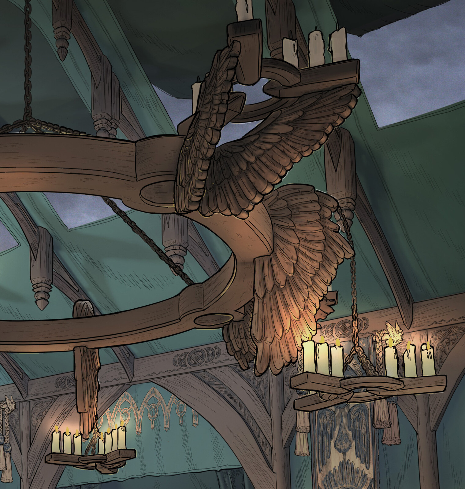
The Siege: King’s Tent War-Room
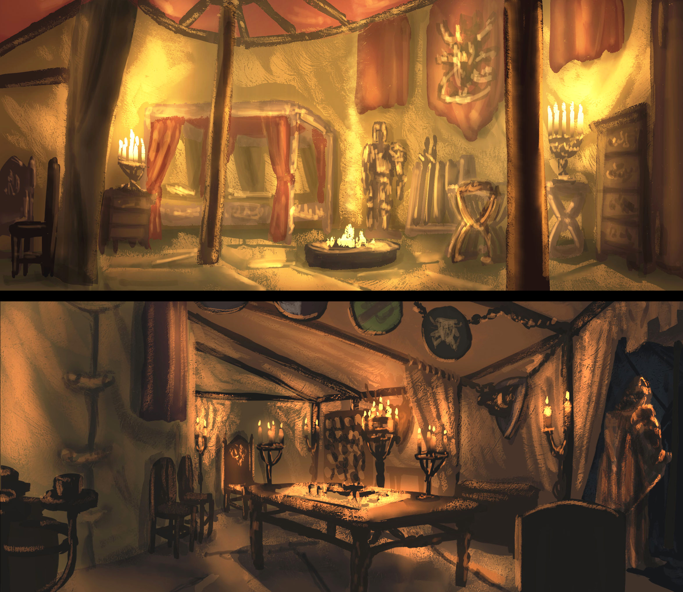
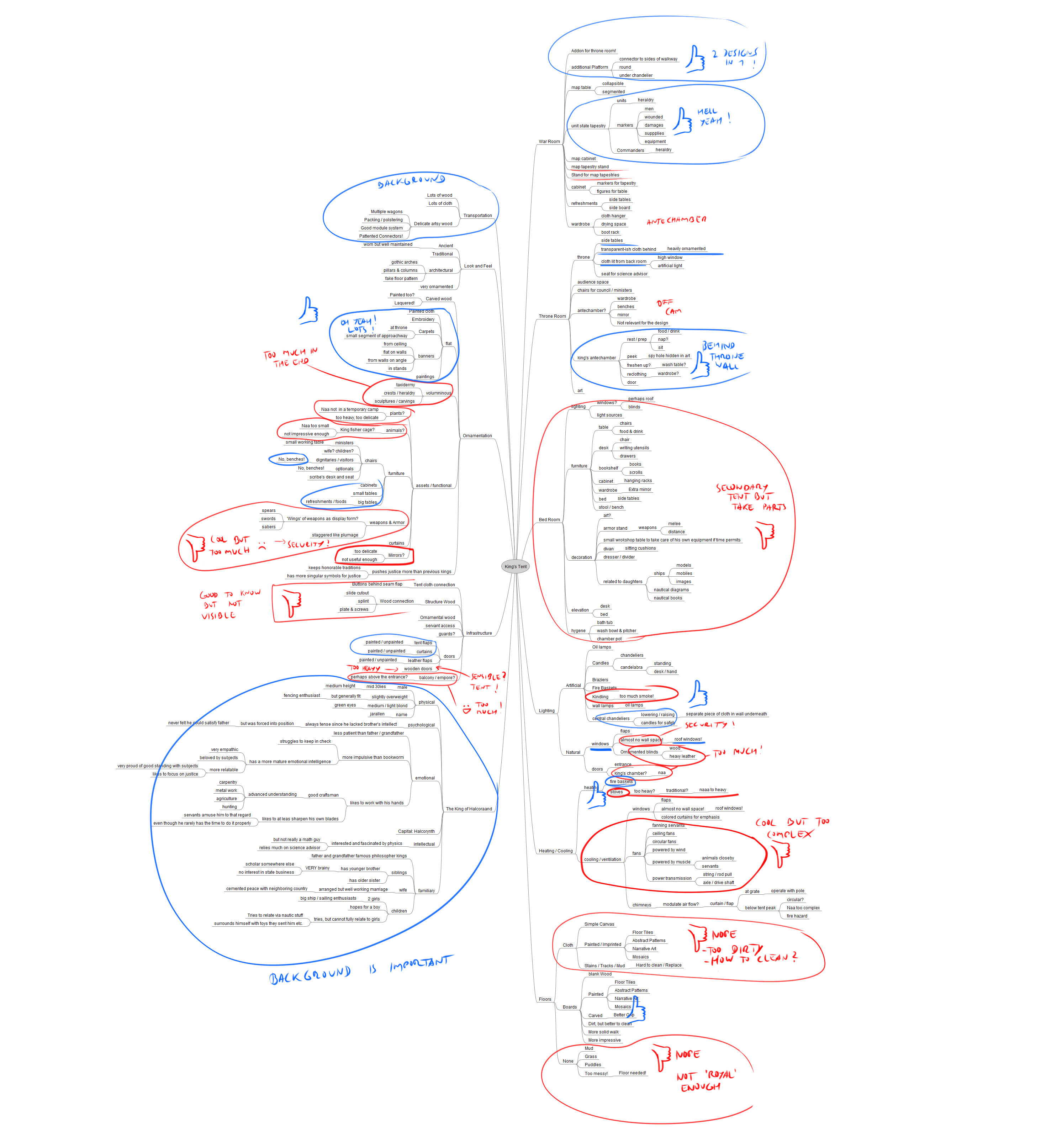
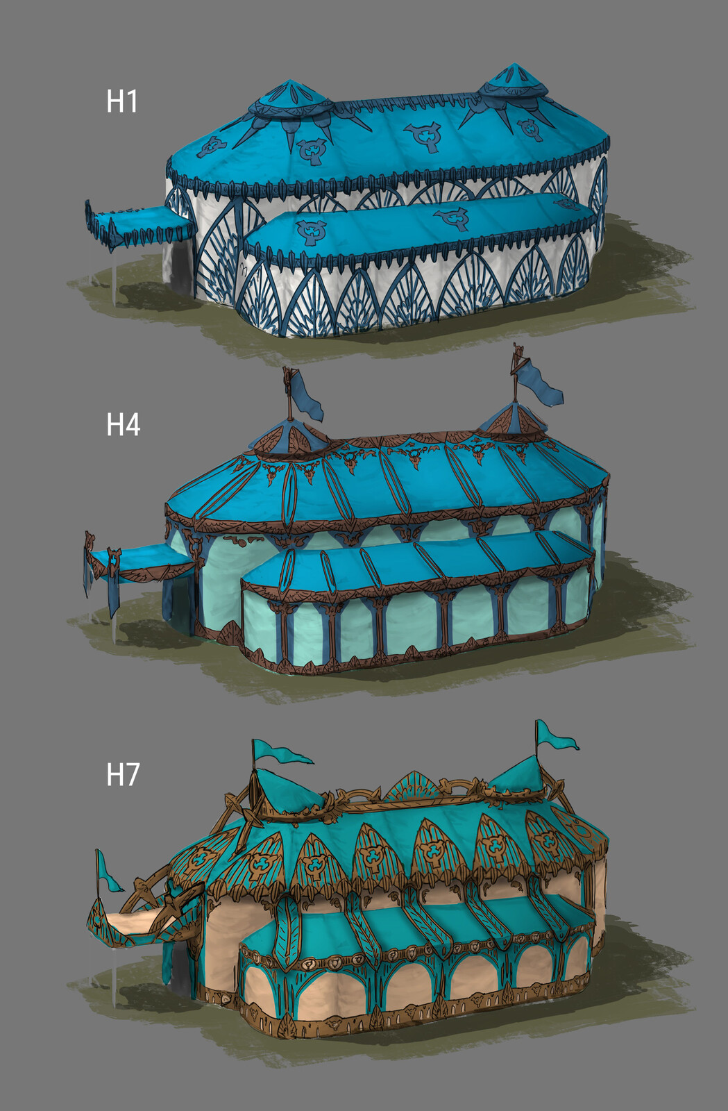
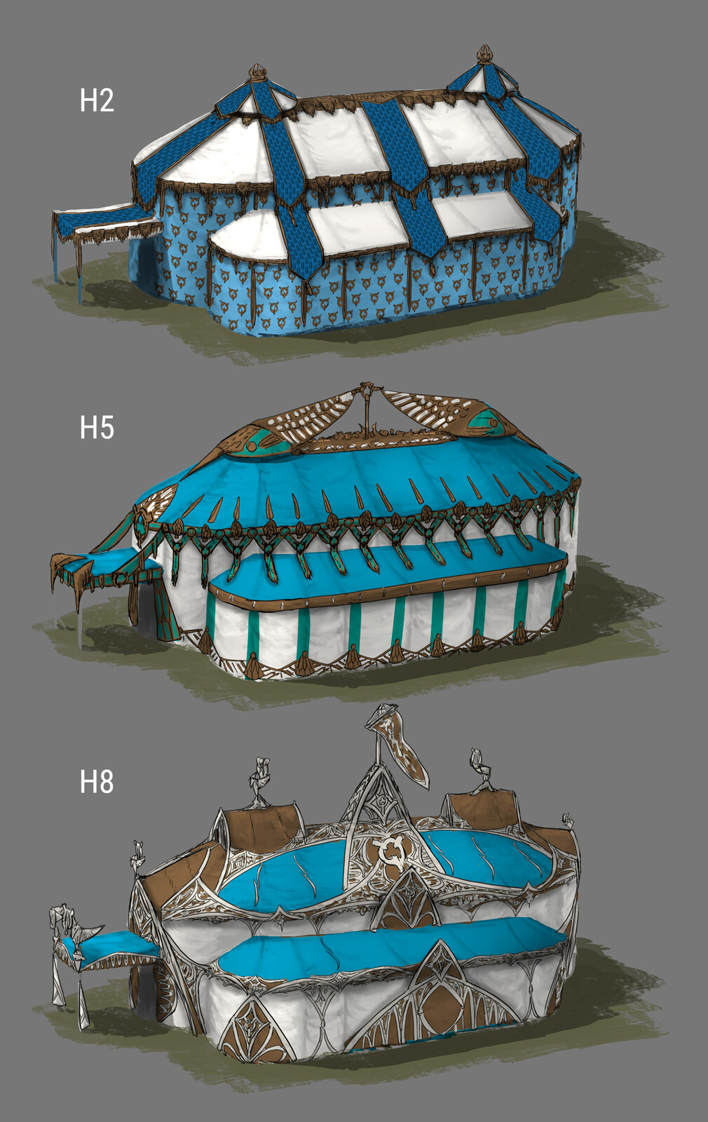
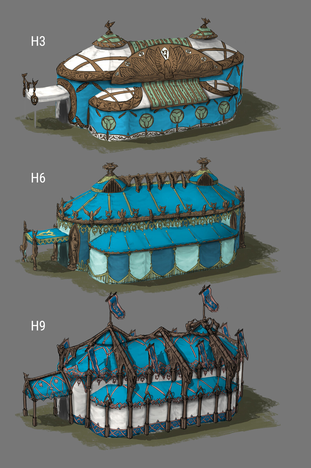
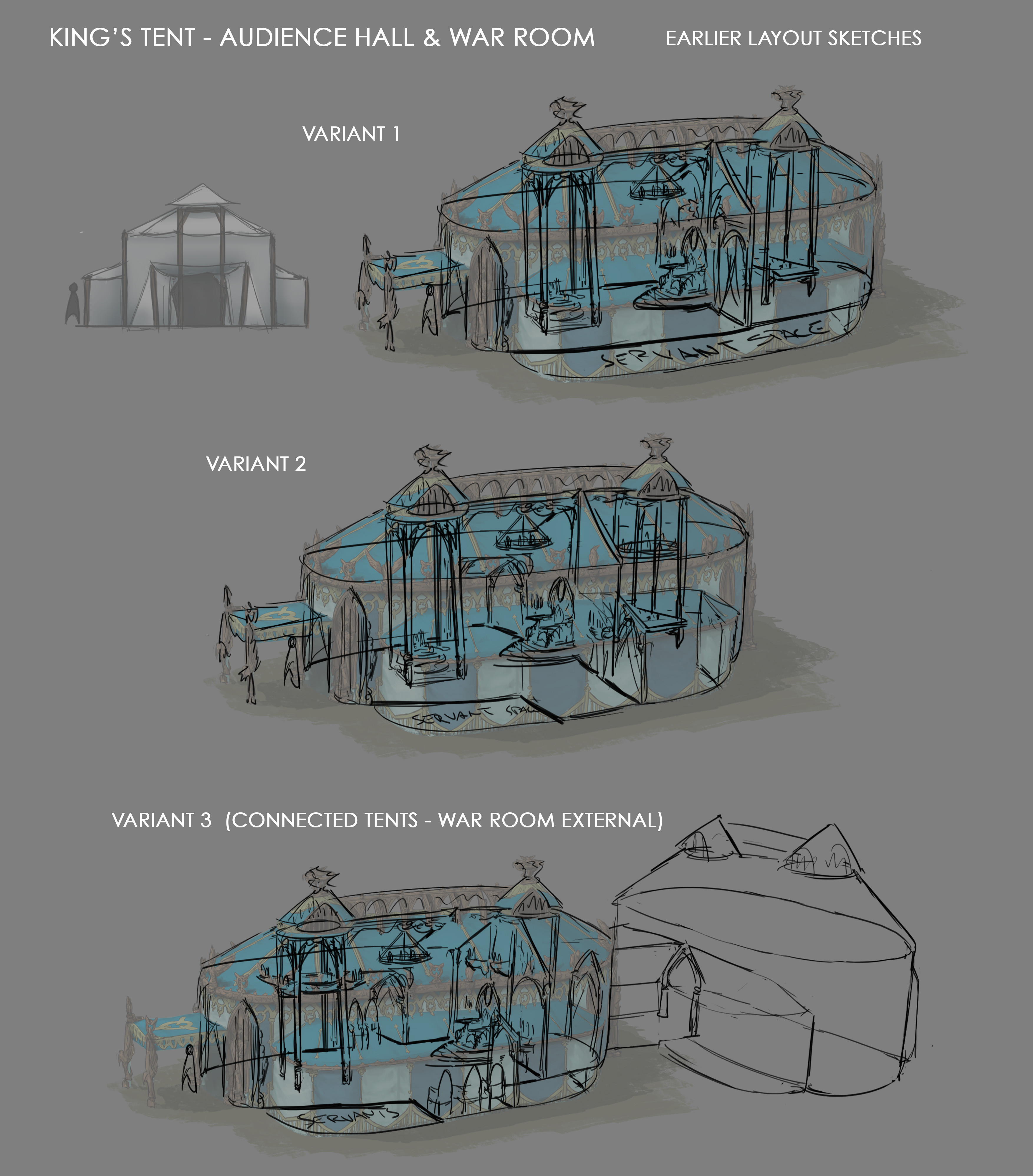
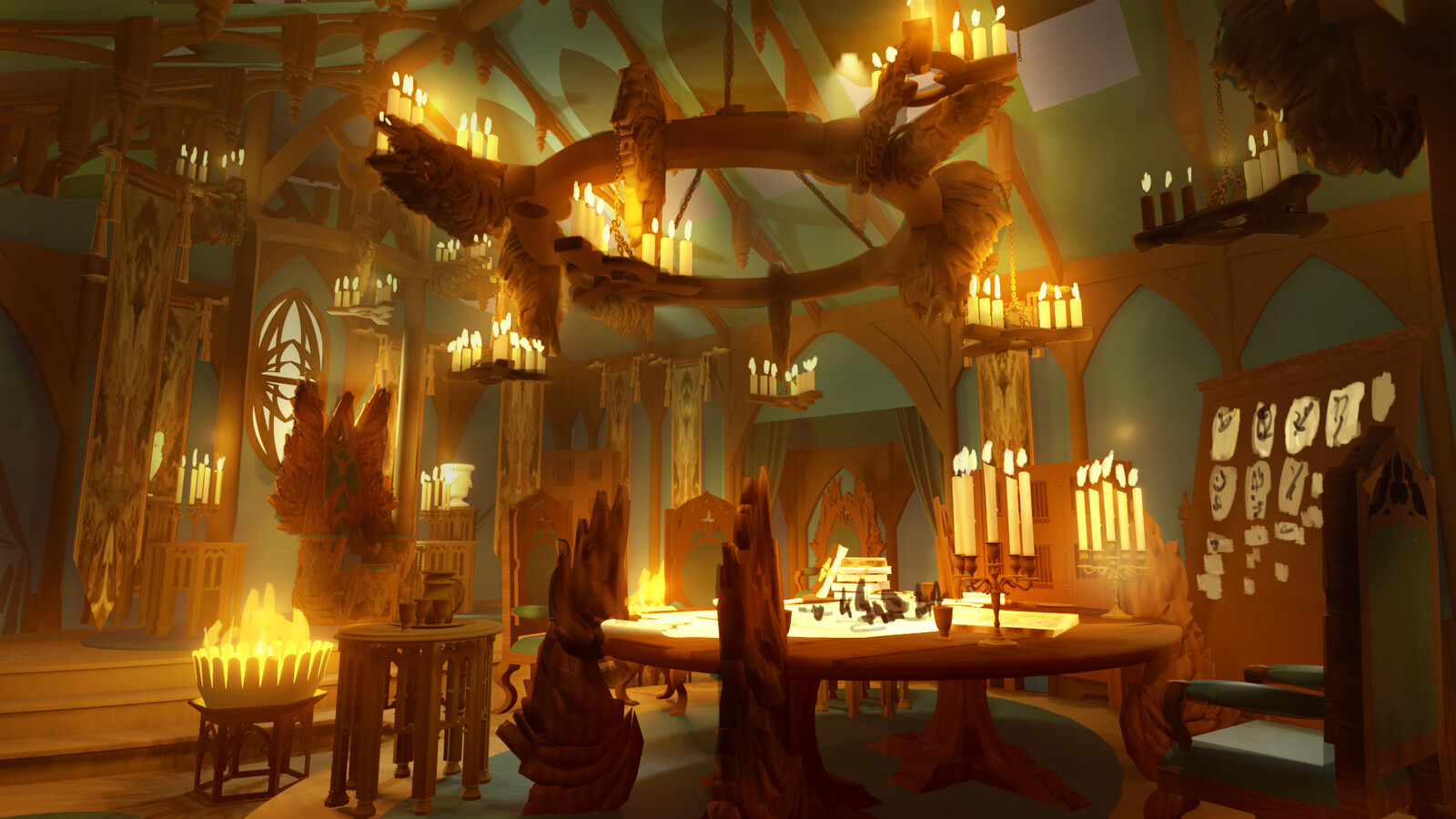
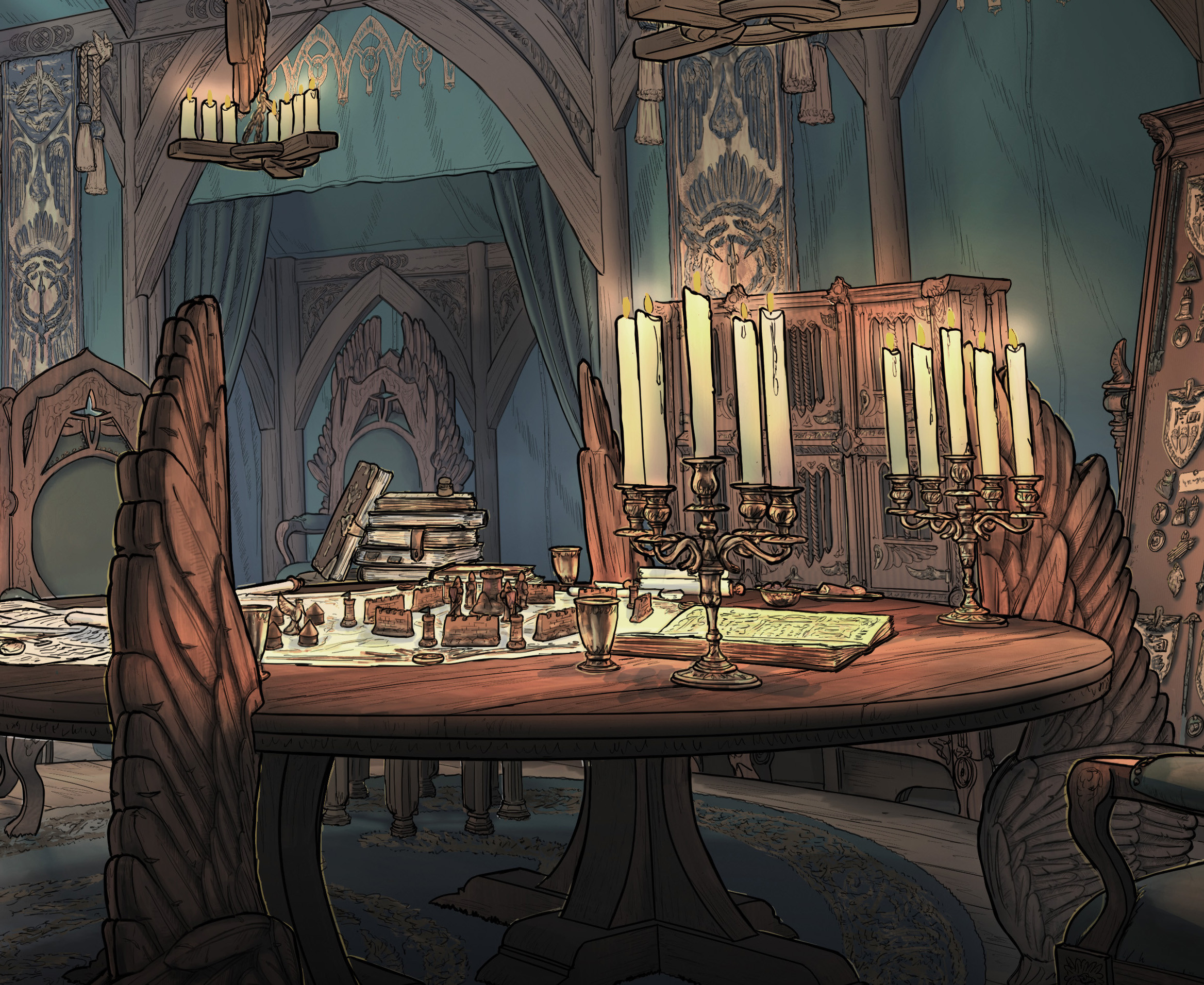
After I have already used the exterior design of the king’s tent for some visuals of the siege camp itself, it is time to show the interior of that field audience hall. Designing this environment, I started as usual with a couple of quick warm up paint sketches, lots of research and non visual background development, thinking about a fantasy culture that has developed this mobile palace as demonstration of power and wealth for generations.
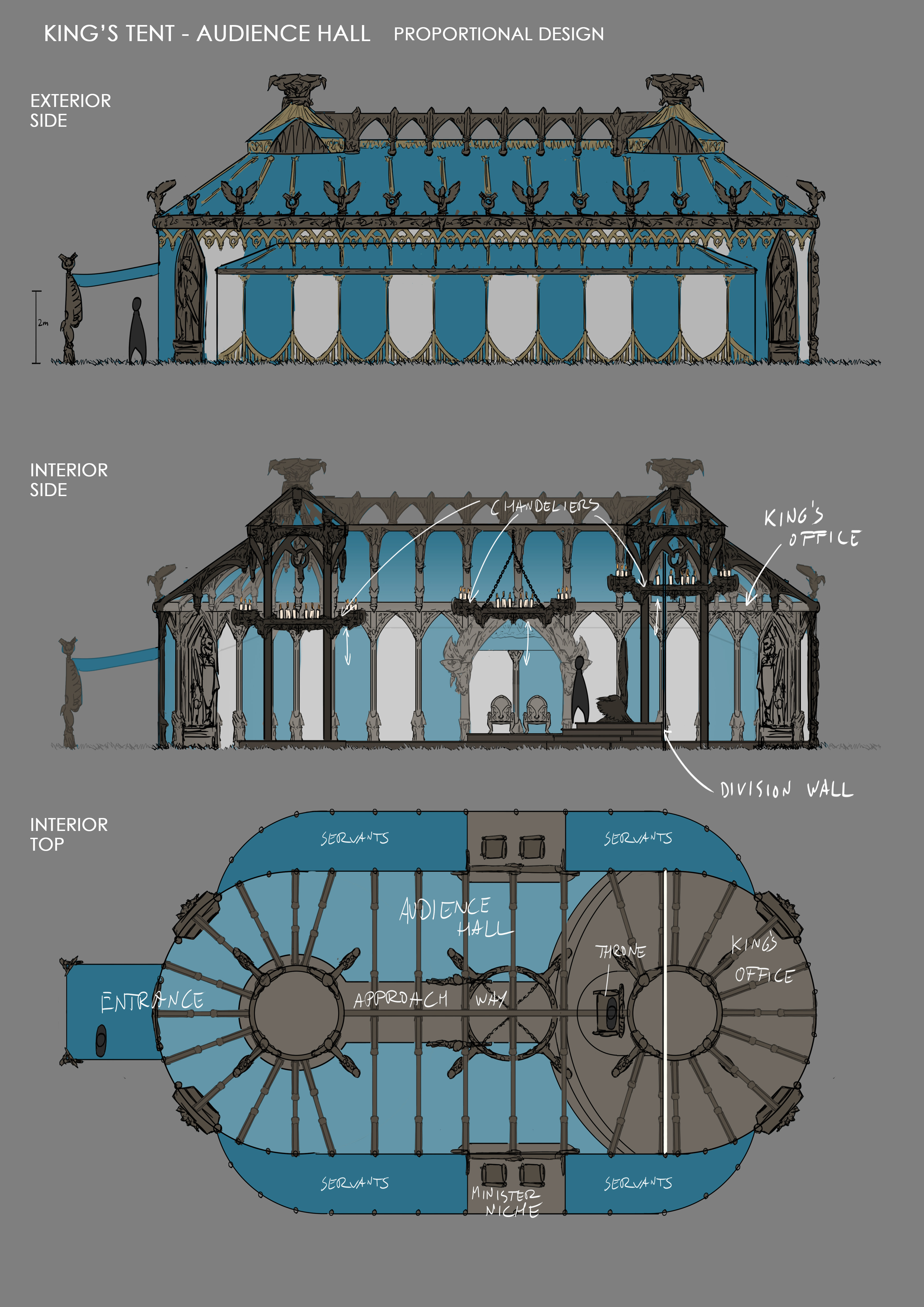
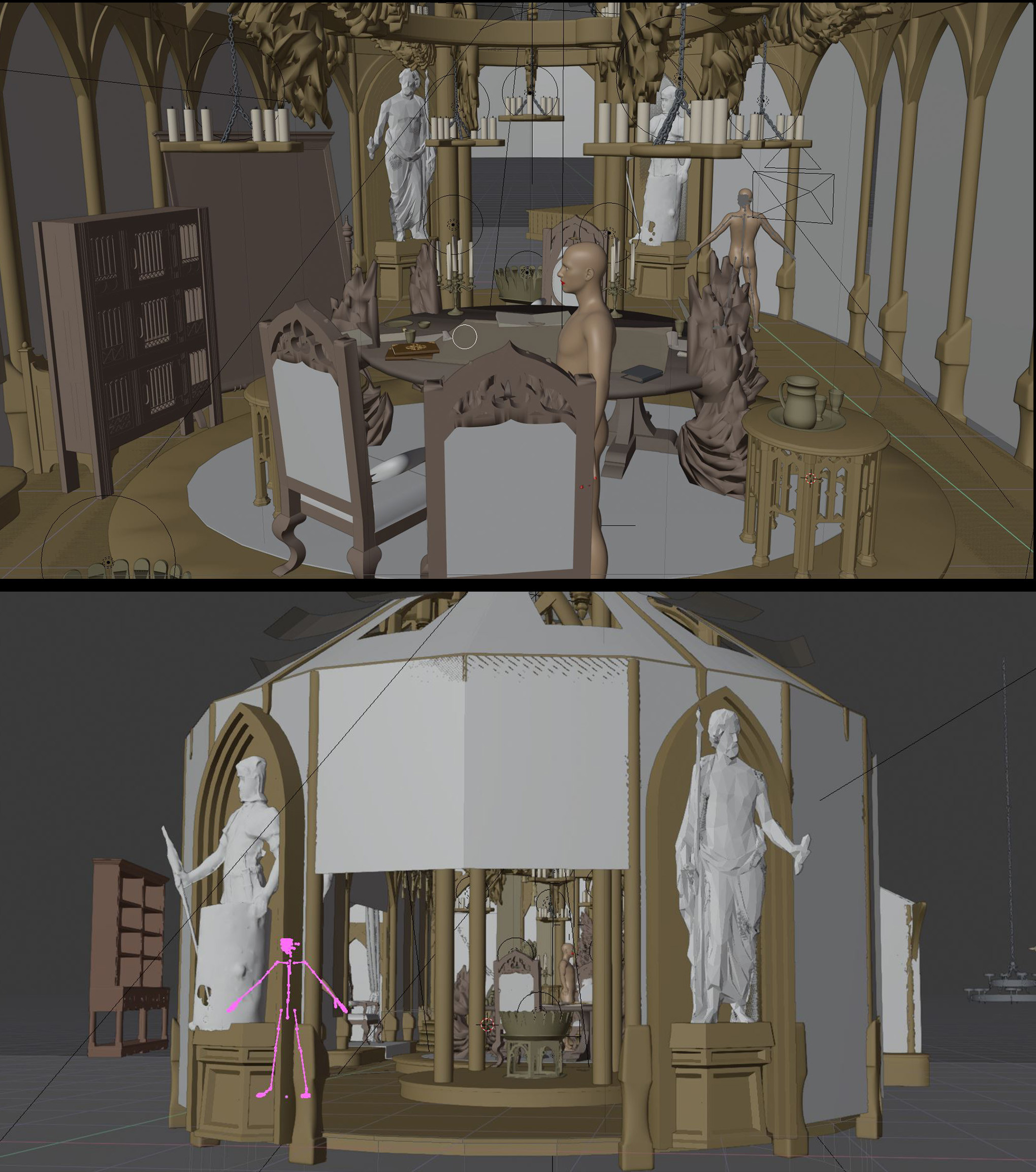
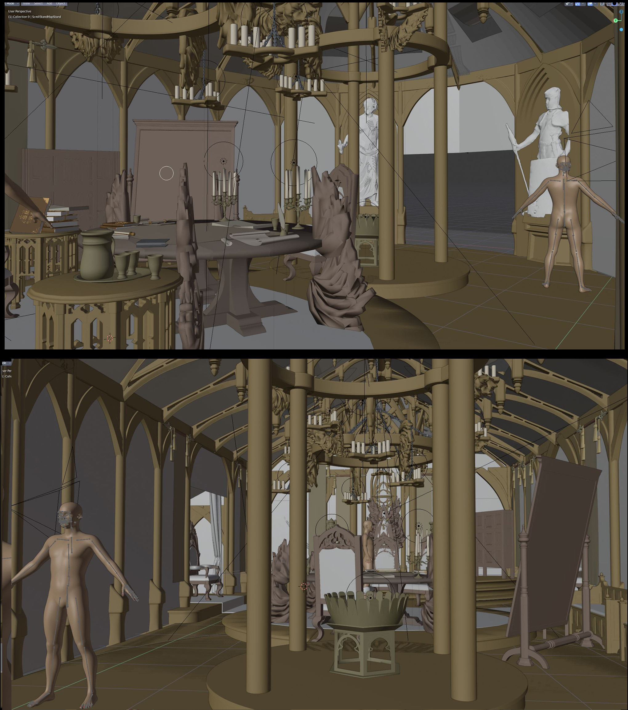
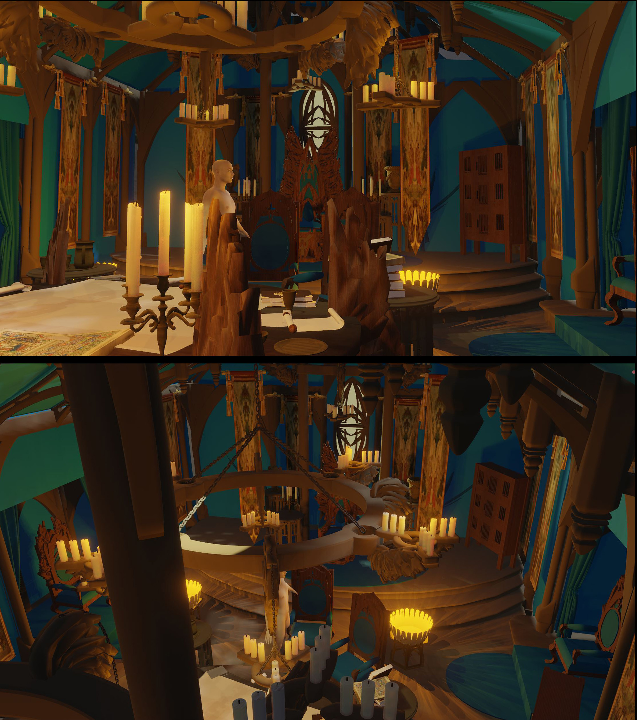
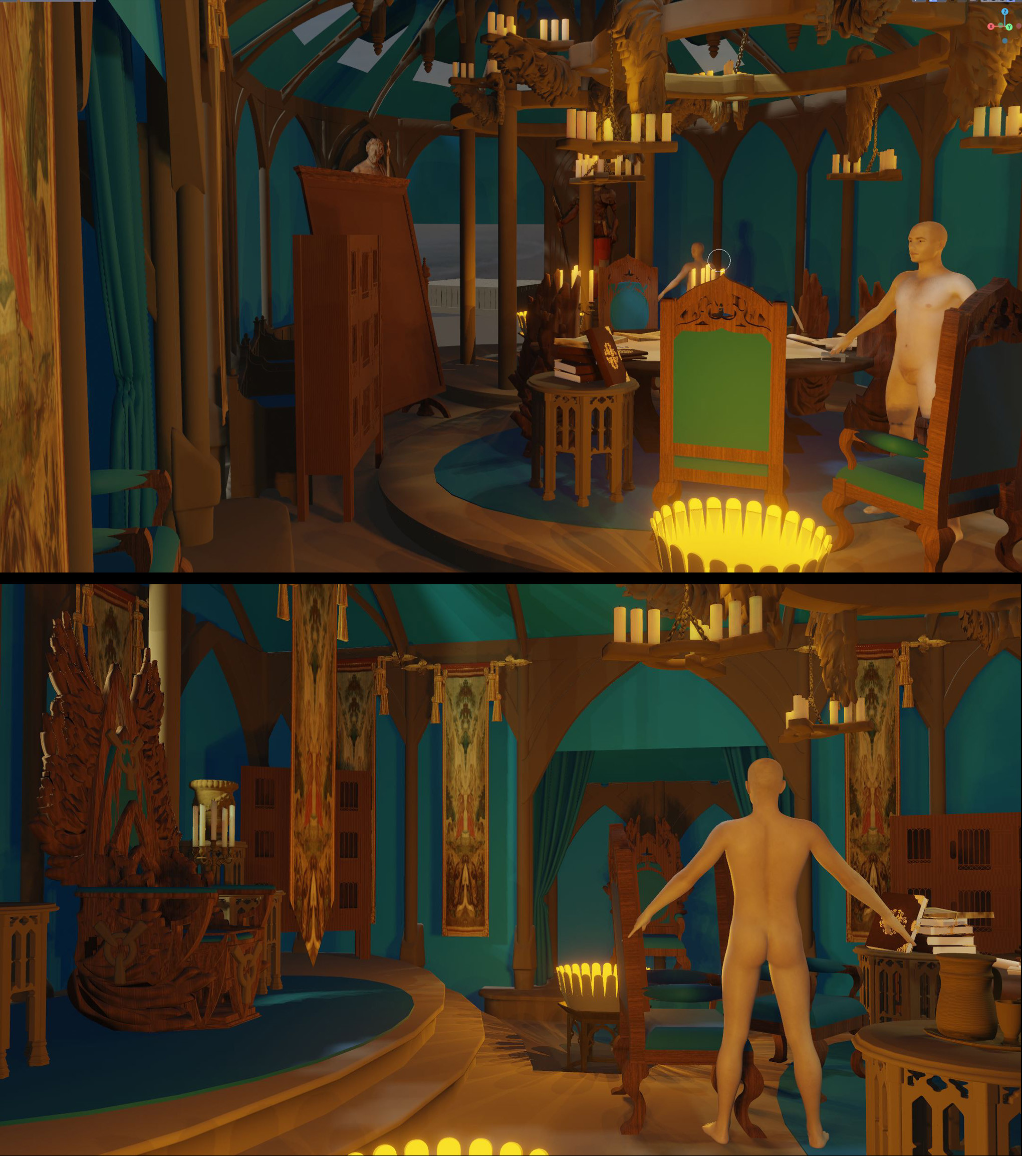
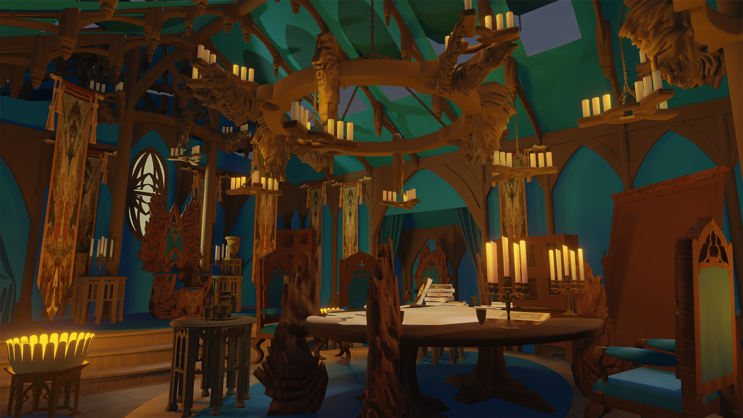
With the design sketches done it was time to put some tangible proportions and spacial correctness into the King’s audience tent, which could double as a war-room. Therefore I took the sketches into blender and blocked out the tent and the furniture, dropped in some basic materials and lights, then had a lot of fun to fool around with the camera to find my desired shot.
A couple of test renders and sketchy previews and I was good to go.
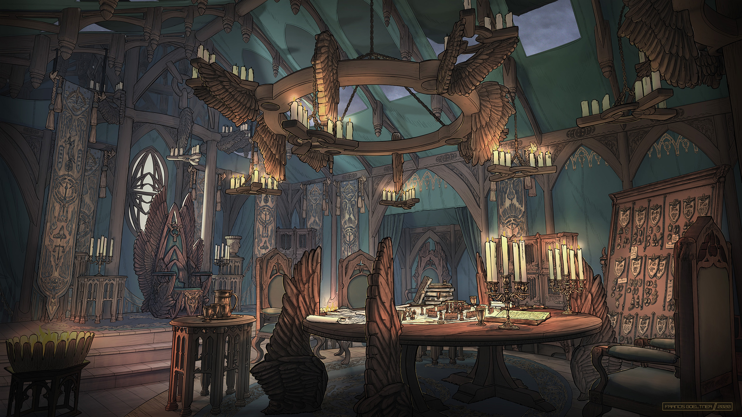
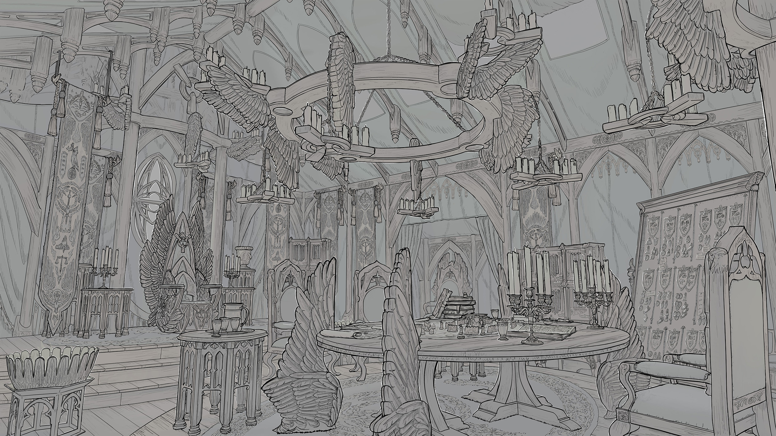
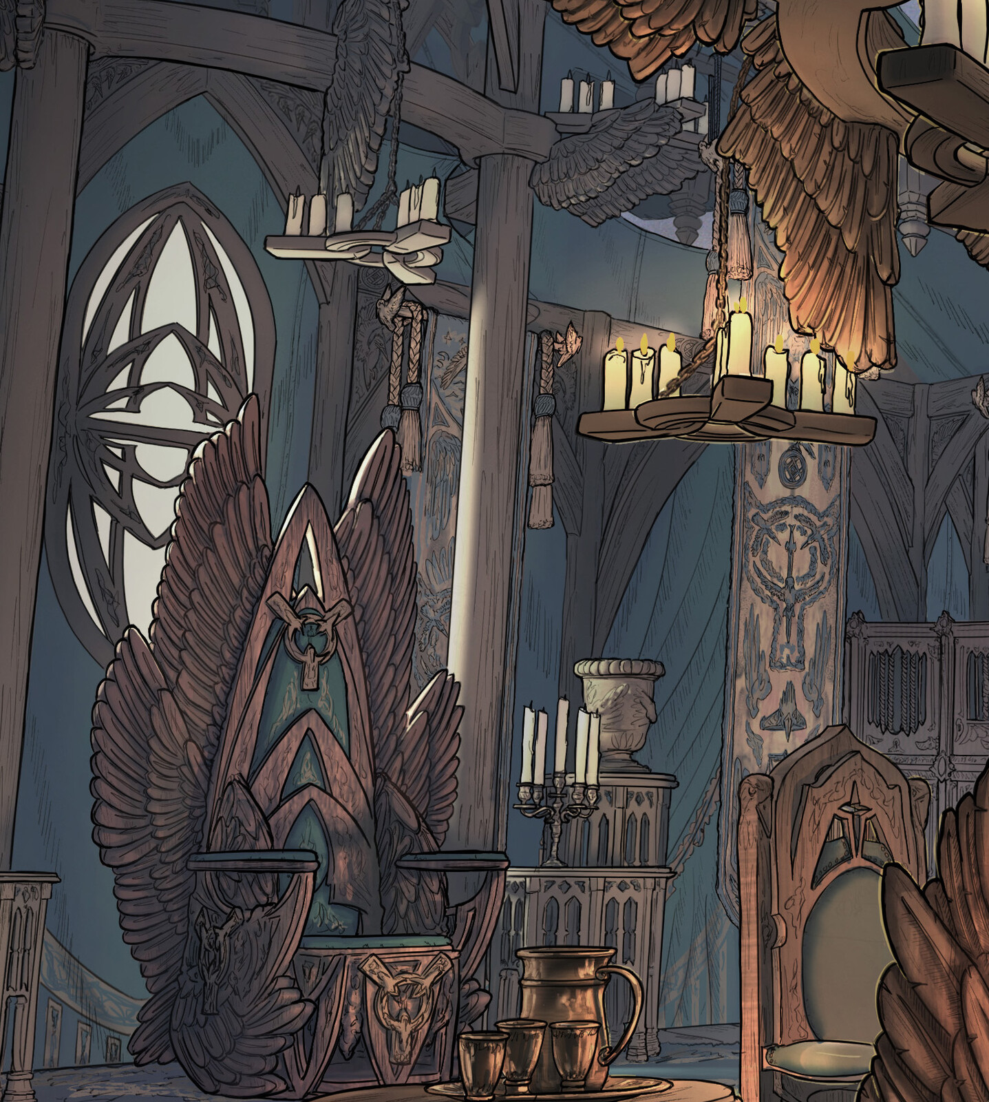
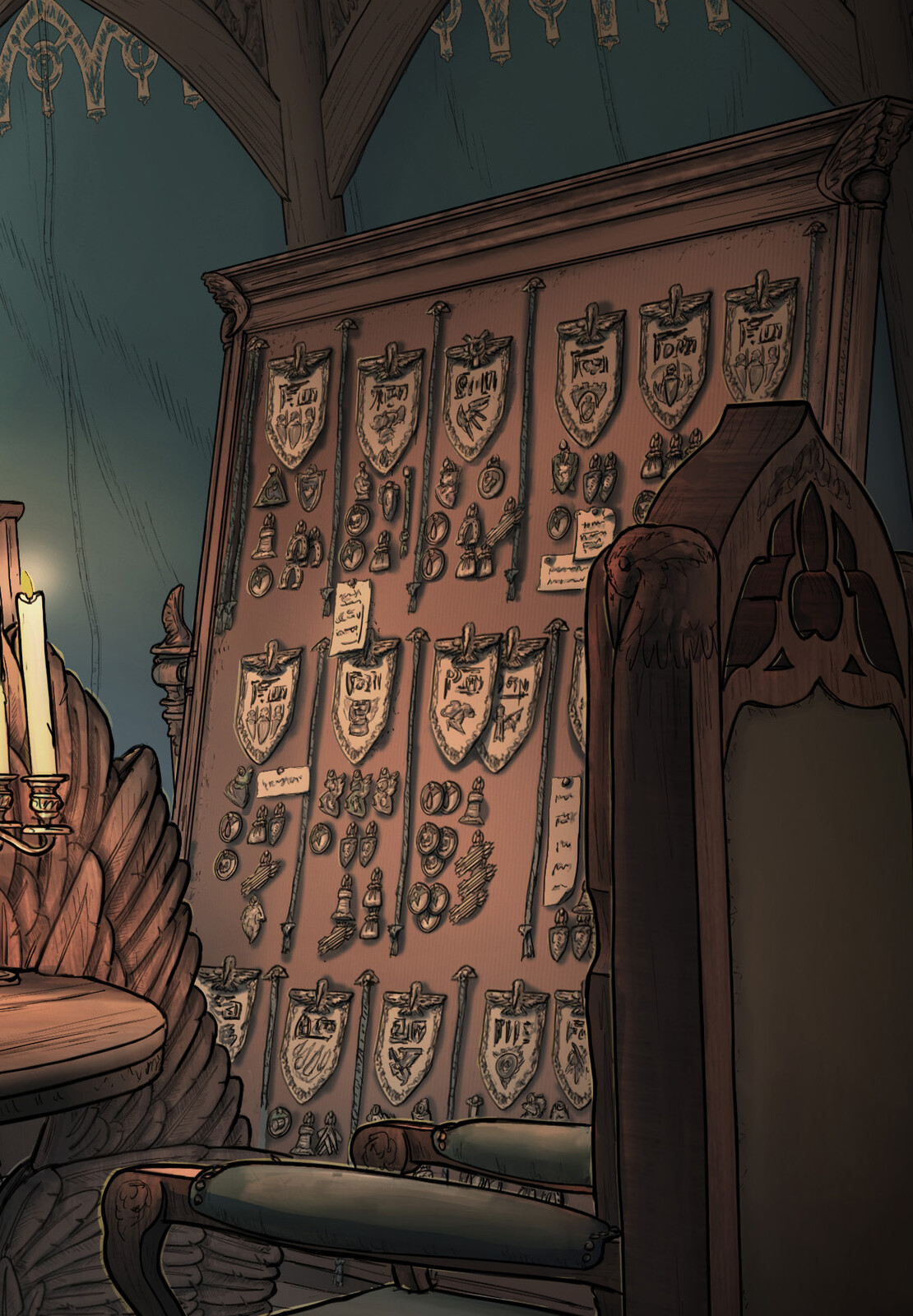
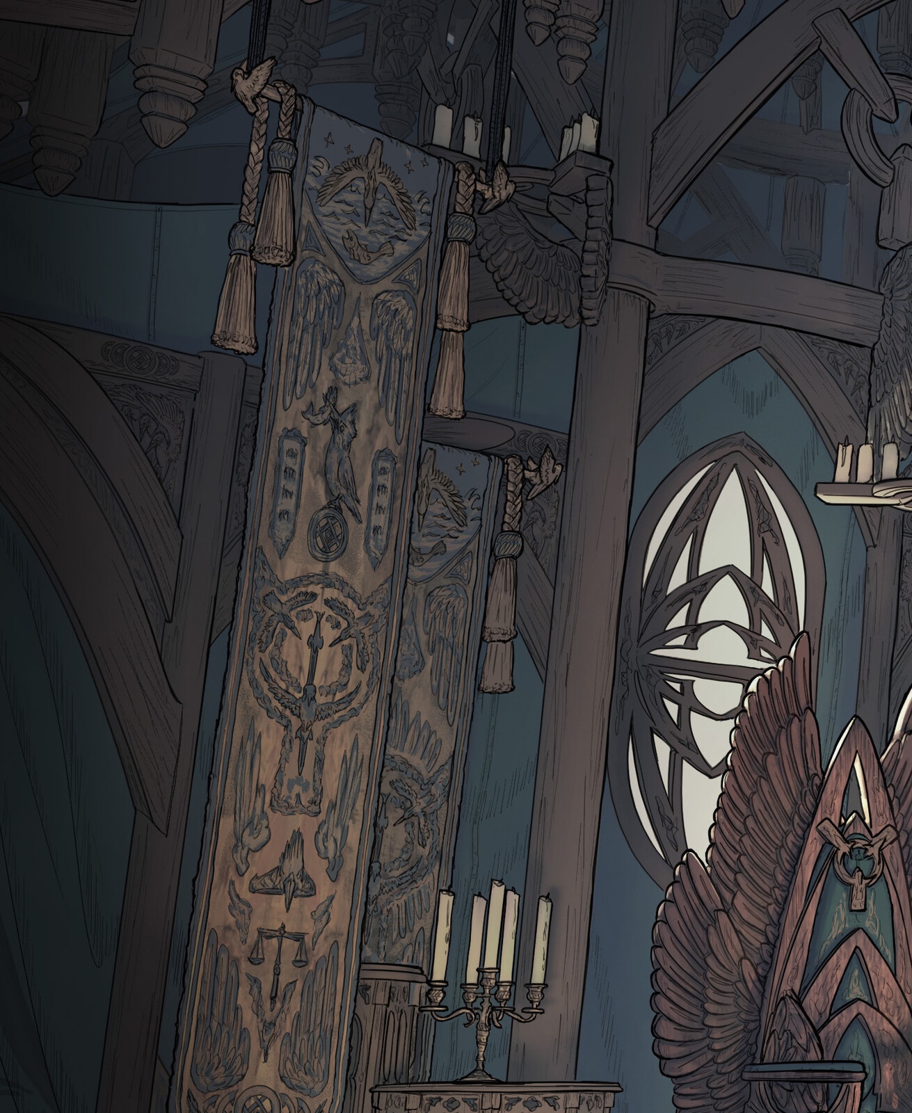
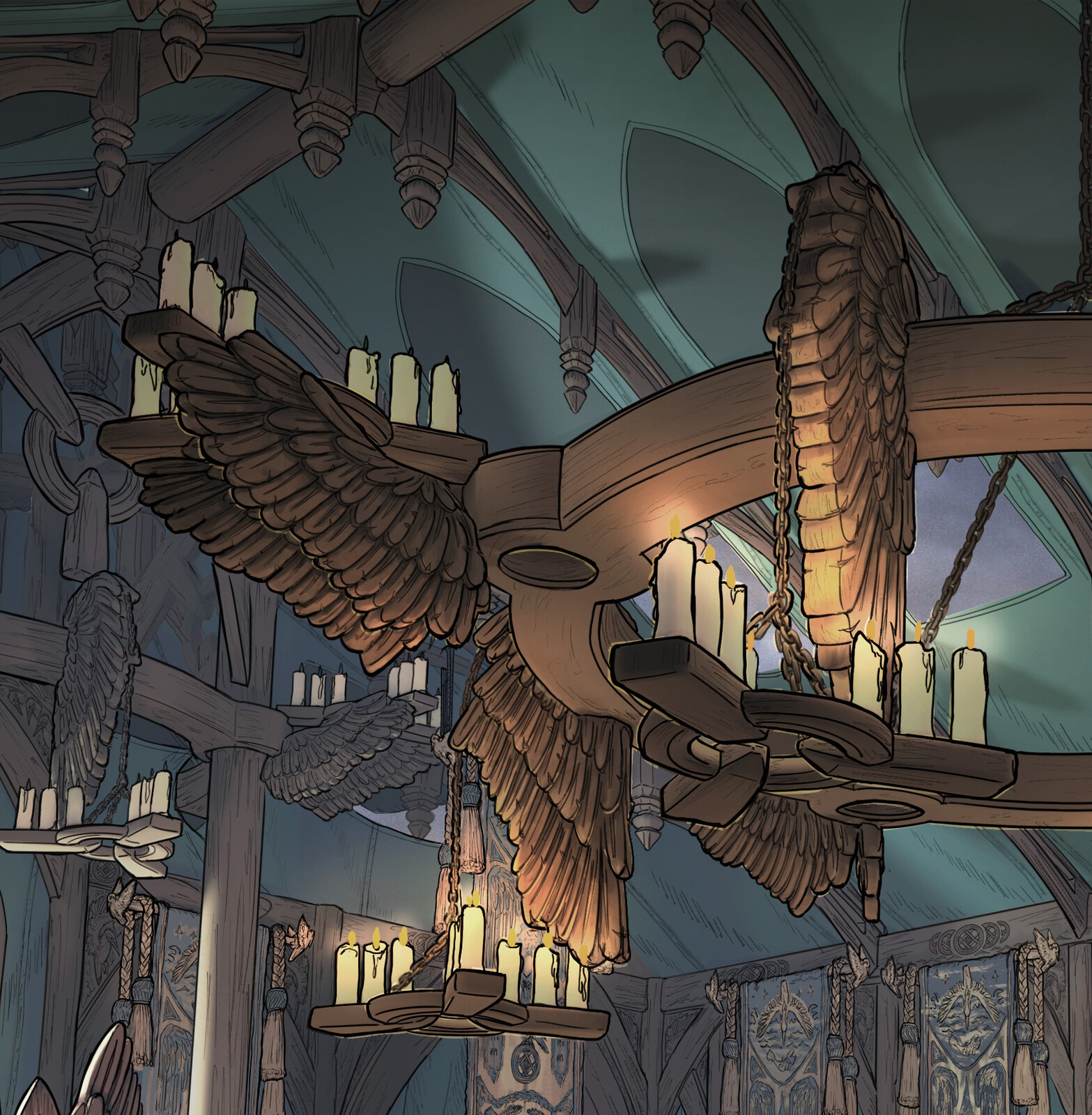
...And finally the finished piece, pure lines and some extracts for detail’s sake.
That is the thing I love about the line drawings: You can just go in and really figure things out.
Nevertheless I want to come back to this environment when I have time and paint it out - probably in a different lighting scenario.
This environment has been part of a design process demo for students at FZD and more designs are always in the making ;).

